Irving Penn
American, born 1917
American, born 1917
Born in New Jersey,Irving Penn studied design at the Philadelphia Museum School, where he became a student of Alexey Brodovitch. In 1937, the year before he graduated, several of his drawings were published by Harper's Bazaar. From 1940 to 1941, he worked for the art and advertising director of Saks Fifth Avenue, and the following year he spent in Mexico painting, a medium he subsequently abandoned. Returning to New York, Penn was hired by Vogue magazine, first to create ideas for cover illustrations, then to photograph covers as well as editorial illustrations for the interior of the magazine. Working closely with Alexander Liberman, Penn developed a highly stylized, graphically compelling form of fashion photography which did much to define post-war notions of feminine chic and glamour. In his fashion and portrait photography, Penn favored the use of a neutral backdrop of gray or white seamless paper, or alternatively, the use of constructed architectural sets which created striking effects with oblique, diving diagonals and upward tipped perspectives. Penn also created numerous still life compositions for the magazine: carefully orchestrated assemblages of food or objects characterized by a play of three-dimensional and two-dimensional forms. In 1953 Penn opened his own commercial studio and almost immediately became one of the most influential and successful advertising photographers in the world.
Eschewing any notions of naturalism, spontaneity, or chance, Penn has always favored the rigidly controlled, formal conditions of the studio. Thus, even when photographing North African nomads, New Guinea tribesman, Peruvian Indians, or Hell's Angels, Penn contrived portable studios that permitted much the same degree of elegant and structured lighting and composition that he used to photograph fashion models and socialites.
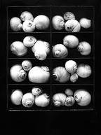
in addition to his fashion and commercial work, Penn has produced a body of art photography. Using platinum and other precious metal processes, Penn has photographed urban detritus (cigarette butts, crumpled wrappers, etc.), the torsos of plump artists' models, and most recently, still lifes of skulls, bones, and construction materials. While the subject matter represents the antithesis of his fashion and commercial work, as does the use of artisanal printing processes produced in numbered editions, both bodies of work reveal the same preoccupation: balance of form and carefully calibrated composition, with nuances of light and tone, presenting a subject that is emotionally neutral or kept always at emotional and psychological arm's length.
Eschewing any notions of naturalism, spontaneity, or chance, Penn has always favored the rigidly controlled, formal conditions of the studio. Thus, even when photographing North African nomads, New Guinea tribesman, Peruvian Indians, or Hell's Angels, Penn contrived portable studios that permitted much the same degree of elegant and structured lighting and composition that he used to photograph fashion models and socialites.
in addition to his fashion and commercial work, Penn has produced a body of art photography. Using platinum and other precious metal processes, Penn has photographed urban detritus (cigarette butts, crumpled wrappers, etc.), the torsos of plump artists' models, and most recently, still lifes of skulls, bones, and construction materials. While the subject matter represents the antithesis of his fashion and commercial work, as does the use of artisanal printing processes produced in numbered editions, both bodies of work reveal the same preoccupation: balance of form and carefully calibrated composition, with nuances of light and tone, presenting a subject that is emotionally neutral or kept always at emotional and psychological arm's length.
Irving Penn studied under Alexey Brodovitch at the Philadelphia Museum School from which he graduated in 1938. Penn's drawings were published by Harper's Bazaar and he also painted. As his career in photography blossomed, he became known for post World War II feminine chic and glamour photography.
Penn has worked for many years doing fashion photography for Vogue magazine. He was among the first photographers to pose subjects against a simple grey or white backdrop and used this simplicity more effectively than other photographers. Expanding his austere studio surroundings, Penn constructed a set of upright angled backdrops, to form a stark, acute corner. Posing his subjects within this tight, unorthodox space, Penn brought an unprecedented sense of drama to his portraits, driving the viewer's focus onto the person and their expression. In many photos, the subjects appeared wedged into the corner. Subjects photographed with this technique included Martha Graham, Marcel Duchamp, Georgia O'Keeffe, W. H. Auden, Igor Stravinsky and Marlene Dietrich.
While a master of the studio flash, most of Penn's portraits are lighted with window light. For travelling to New Guinea and other locations to photograph indigenous people, Penn created a portable studio with a skylight deployed facing north with impressive results. These pictures had the same feel as his portraits of celebrities; fully adorned, naturally lighted, yet placed before the neutral backdrop, his tribal subjects appear as strangely defined models for a 19-century ethnographic investigation.
In 1950, Penn married his favorite model, Lisa Fonssagrives and he founded his studio in 1953. They have one son together, who is named Tom.


Clarity, composition, careful arrangement of objects or people, form, and the use of light characterize Penn's work. Penn also photographs still life objects and found objects in unusual arrangements with great detail and clarity.
While his prints are always clean and clear, Penn's subjects vary widely. Many times his photographs are so ahead of their time that they only came to be appreciated as important works in the modernist canon years after their creation. For example, a series of posed nudes whose physical shapes range from thin to plump were shot in 1949-1950, but were not exhibited until 1980.
His still life compositions are skilfully arranged assemblages of food or objects; at once spare and highly organized, the objects are raised to a graphic perfection, articulating the abstract interplay of line and volume.
Legacy
He has published numerous books including the recent, "A Notebook at Random" which offers a generous selection of photographs, paintings, and documents of his working methods. Penn's wife, Lisa Fonssagrives, died in 1992.
Below are some images that I have created to emulate the point of view and subject matter of Irving Penns work.
Picture 1:
I chose this subject matter because of the colours, shapes and textures they provide. I wanted to create an image of contrasting shapes and textures hence the liquid on the spoon, the lettice's messy and ramdom form, the carrots simple and straight form and the tomatoes round shape. I tried to emulate Penns simple subject choice, focal point and point of view. I like the simplicity of the shot and the clean lines and edges. The slightly embossed paper and the pepper, create just enough distraction.

Picture 2:
This image is even more true to Penns simple approach. I have left out the pepper so it is an even more simple and straight forward image.

The issue with this image is the lack of contrasting colors, all of them apart from the red tomatoes are quite bland. I prefer the top image as it has more definition and contrast in both the texture and the tones.
Picture 3:
This next picture is taken using Penn as an influence as I have diverted away from the view point, favoring a lower line of sight.

Because of the shorter focal length and lower line of sight, there is more detail in the lettuce leaves and in the salt, resting on the spoon.