After graduating from Wellesley College in 1963 with a degree in Art History, Olivia Parker began her career as a painter. She became intrigued with photography in 1970. Mostly self-taught in photography, she usually constructs what she photographs in the studio. Her photographs are fundamentally still life inspired by those painted in the traditional Dutch, Flemish and Spanish 17th century style, with their torn petals, sumptuous but imperfect fruit and improbable insects. Parker feels that photographic still life is still an open arena precisely because of those intrinsic qualities of this contemporary medium that distinguish it from painting. She says that the expression of the classical ideals of form is "dead matter" because the objects she chooses to photograph, whether alive or dead, are instead all signs of life. She is drawn to the implication of visual edges; the swollen limits of a ripe pear touching a hard line or light downy feathers, confined by a metal grid. Her photographs ask viewers to continually evaluate their meaning by never truly defining where the eye comes to rest.
Picture 1 - Top
The images of Olivia Parker above are simple yet effective. The four peas at the top produce an image full of texture, different shapes and tones. The lighting is high key with small shadows being cast from the end of each pod. The composition is simple yet effective as the pea have been position in lines, next to each other. This creates a sense of order and precision to the shot.
The images of Olivia Parker above are simple yet effective. The four peas at the top produce an image full of texture, different shapes and tones. The lighting is high key with small shadows being cast from the end of each pod. The composition is simple yet effective as the pea have been position in lines, next to each other. This creates a sense of order and precision to the shot.
Picture 2
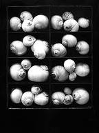
The sense of order continues into the next shot, that of snail shells in a wooden box. the box is divided into eight compartments and the shells arranged in a random order in each compartment. The high contrasting tones between black and white create texture in interest in the picture and the round shapes of the shells contrast with the square boxes in which they are contained.
Picture 3
The picture below this again, contains lines and order, mixed with randomly positioned objects. The piece of wood that the mushrooms sit on is hightly textured and has a deep grained effect. The black and white nature of the image enhances this contrast between the tones and creates texture.
This image is in a completely different style to the others. It shows the picture of a dried rose. It doesn't contain the order and simplicity of the previous images, instead it contains random patterns, complex shapes and less contrasting tones.


No comments:
Post a Comment